


How To Choose The Right Chart Type For Numeric Data
On many occasions, you might need to create or draw some simple charts or diagrams to illustrate the data to give a better picture of the study results to your co-workers, managers, or clients for any research.
Microsoft Excel allows you to create charts in a variety types. Charts can simplify data in a presentable and visually pleasing way. How to pick the suitable chart for your data depending on the message you want to convey. However, many people do not understand the strengths and weaknesses that come with each chart type. Here are the simple chart chooser diagram that might help you.
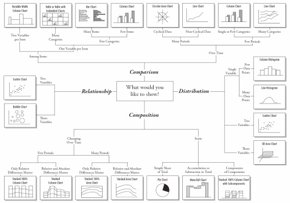
Start from the center of the chart chooser diagram and take the route that matches your data type. Is the data static or does it changes over time? Does the chart show a comparison or relationship between data? You may sometimes have to draw more than one chart.
The poster, designed by Andrew Abela, is also available as a PDF.


Recent Articles
- How To Download HBO Shows On iPhone, iPad Through Apple TV App
- Windows 10 Insider Preview Build 19025 (20H1) for PC Official Available for Insiders in Fast Ring – Here’s What’s News, Fixes, and Enhancement Changelog
- Kaspersky Total Security 2020 Free Download With License Serial Key
- Steganos Privacy Suite 19 Free Download With Genuine License Key
- Zemana AntiMalware Premium Free Download For Limited Time